Visual design language and guidelines
# Colors
The colour helps GoPro distinguish their brand to create consistency across their multiple platforms and software they have available.
I have named the primary colour "Wave blue", as a big part of the explosion of GoPro in the videography market was its usability under water. Attracting surfers, divers, and allowing any type of water activity to be captured on the device like the eye of a fish. The colour embeds the characteristics of the product and its connection to the natural environment.
# Primary palette

The GoPro app primary pallette is singular to the colour blue and different shades of this blue for interactions. The colour blue is a trademark for GoPro and is seen accross their whole brand from thier products, marketing materials, and the logo itself.
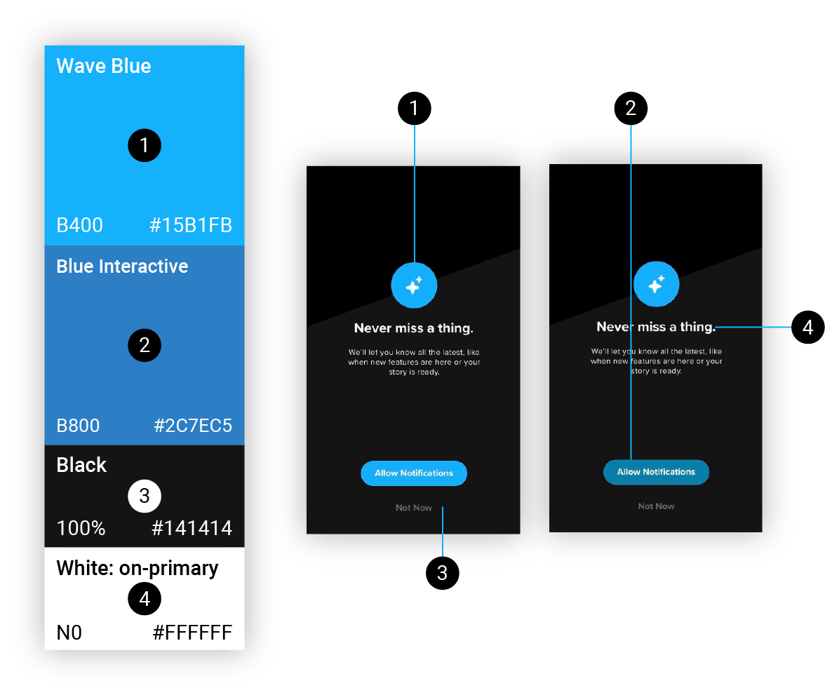
Blue B400 is used for primary actions, buttons, texts, highlights for indicating a streamlined UI progression to the user. B800 is used for 'on hold' to indicate a button press, black is the primary background used within the dark themed interface, and the white N0 is used primarily for headings, body text, and icons.
# Secondary palette

The GoPro app secondary palette is minimal within the GoPro app, only being used where appropriate to accentuate selection parts within the UI. With GoPro ultimately using the 'Wave blue' as a primary colour, the secondary colour palette is rarely used in comparison.
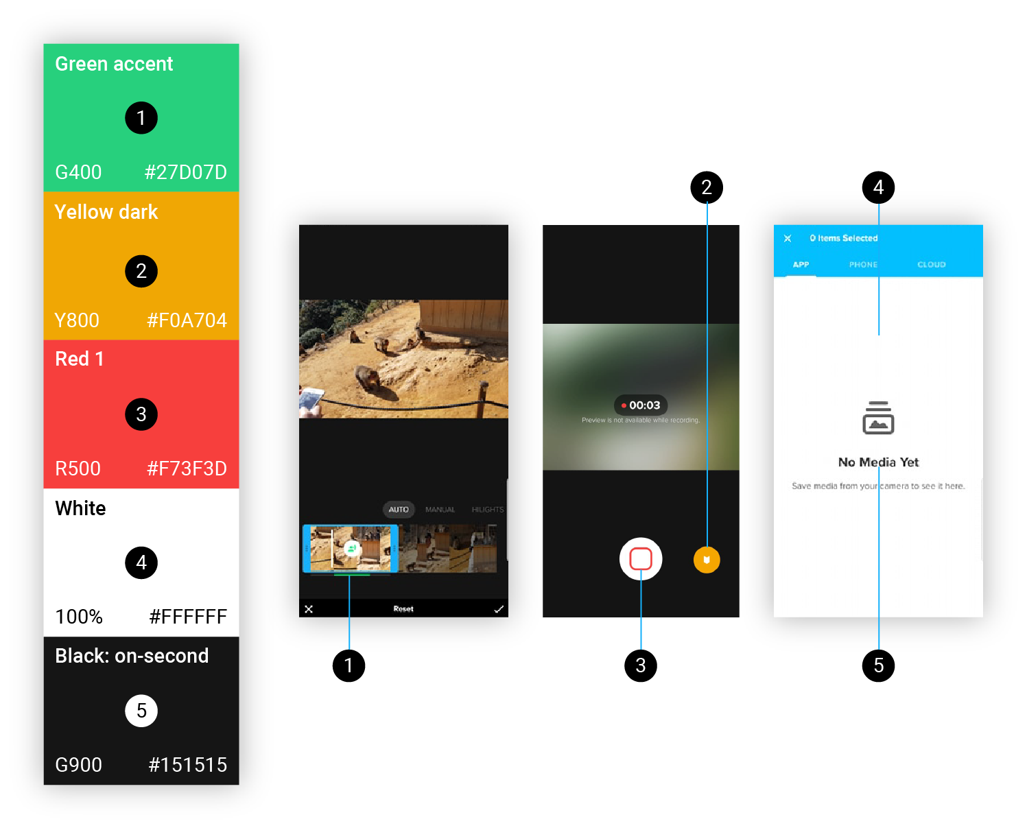
The secondary palette is made up of green (G300), yellow (Y800), red (R500), white background, and dark-grey / black (G900). Each color is selected intentionally to provide meaningful feedback within the UI. White is used as a secondary background for separate sections such as when dealing with video files or dialogs, and the dark-grey (G900) is the font colour on the secondary background. Green (G300) is used for sound control in video editing, yellow (Y800) is used for highlight functionality, and red 1 (R500) is used to indicate a recording state via the app.
# Functional palette

The functional palette consists of colours that typically don't represent the brand but supplement the usability of components within the product.
The overlay black is the same black from the Primary palette but with 60% opacity (transparency), often used behind dialogue & modal components to remove the focus from the layer behind. Grey interactive is used on the tab components as a feedback on press. The Red 2 is often used on the white secondary background to emphasise any unreversable actions such as deleting or discarding edits.
# Typography
# GoPro app's font stack
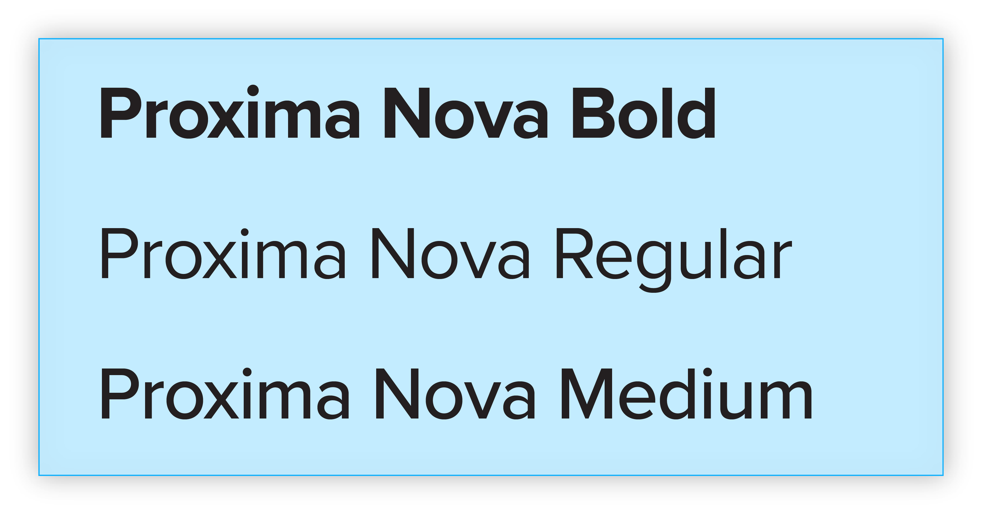
# Proxima Nova
Proxima Nova is the unique typeface we see in the GoPro application, a hybrid that combines modern proportions with a gemoteric appearance. The font family is designed by Mark Simonson and is publicly available here.
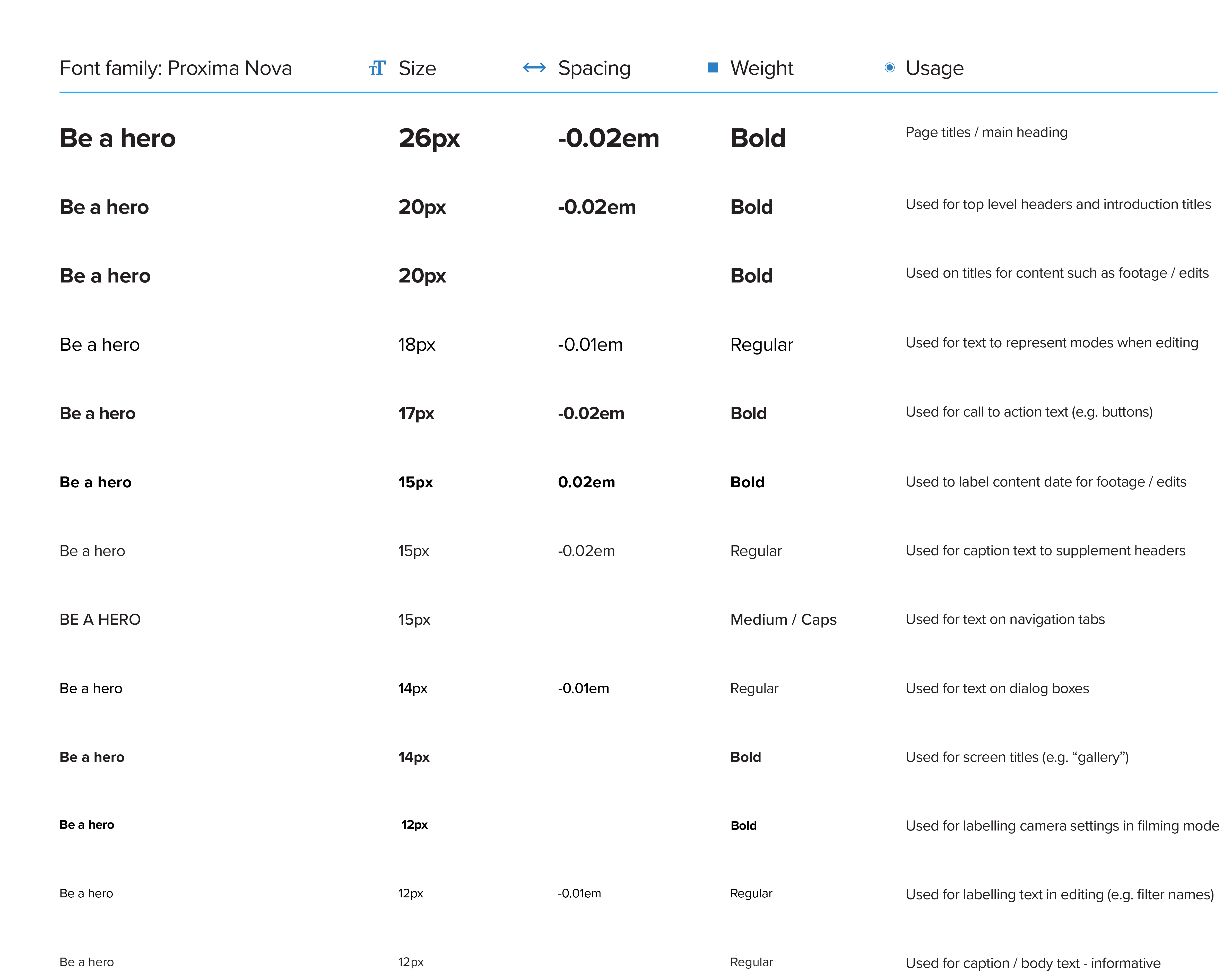
# Type scale
# Brand typography
GoPro uses the Proxima Nova font across their whole brand, from their official websites to their software products for users. In order to create a cohesive ecosystem, the font family is primary for the GoPro brand.

# Product typography
The singular font family system allows for the GoPro app UI to be consistent and frictionless when moving between the Gopro software products.
# Motion
Motion, interactions, and animations communicate the status of an action. With the GoPro app dealing with footage captured by users of the GoPro device, it is important that the feedback and visibility of system status is clear. In example, when editing a footage. Footage is something that can very hard to recapture if something goes wrong, which can cause frustration. The real-time editing in the GoPro app allows the user to feel in control and enhances the creative experience through the GoPro app.
# Motion in the GoPro app
The motion / animations used within the GoPro mobile app integrates the characteristics of the brand’s style.
Expression
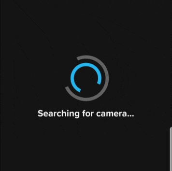
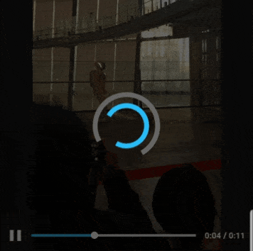
The example animation mimics a camera lens with its circular shape, this motion is reused throughout the other loading states within the app.
Real-time
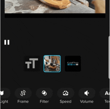
Motion effects are applied to enhance the real-time interactivity with the videos captured. Enabling a rapid video editing experience inside the 'edit' mode.
Informative
The motion supplements information to the user and helps communicate the status to create a streamlined experience for the tasks. It uses motion to communicate the transition from a 'saving' state to a 'saved' state.
# Behaviours
When users interact with the GoPro app. Using feedback indicators like the progessing and spinner component provides information about the completion of a task.
# Components with motion
Showing progress

Use the spinner component with a number to indicate the progress of the current action.
Showing state

Use the spinner component to show a waiting state.
Provide information

Progress bar is another option to show the progress of action but this style is used to show edits being prepared.
# Hierarchy
Motion also helps guide the user through the product by showing a clear hierarchy of how elements in a transition are related.
Transition
Motion shows a clear UI progression between elements.
Relative
Motion indicates the hierarchical relationship between sections.
Provide information
Motion unites the action with the resulting feedback.
# Brand expression
Motion is used to express GoPro’s personality and style. In the home screen, the animation in the background combines action and creativity which is what the app is all about. How we can apply creativity on top of your action footage.